


React hooks are methods, functional components, or stateful logic to test and reuse independently for a specific purpose. You can access their states and functionality and enhance the performance ad readability of any application project. We can create reusable components vis props and hooks.
Reusable components drive the versatility and efficiency of react app building some new components. You can launch multiple UI instances to visualize the differences.
You can scale up your application without putting much effort. Less code and less time lead to rapid development ad accomplishment. It keeps you from hassle and maintenance burden, providing the best logic.
Another advantage of using the reusable react component is to drive consistency and beautiful appearances.
Quick Way to Create Reusable React Components Using Hooks
Here in this blog, we can create input components, button components, toggle components, select components, modal components, etc. We will also teach you rendering, creating the forms, and passing value.
Why Do We Use Hooks Instead of Class Hierarchy?
Before we proceed, know what makes interesting react hooks.
It offers easy sharing even when the logic and components are stored at different states and sources.
It eliminates the unnecessary method or function binding.
Like class components, we don't need to split them and waste our time.
No more confusion because of the 'this' keyword.
It lets us have the freedom to use the logic and UI separately.
Reusable input component
Manage the visualization and customize the input elements' appearance throughout the application for better identification and rendering. As you organize your work, you can pass the props and style by creating a separate folder and file name as FormInput.js preferences.
The reusable react component contains the data/ datasets with the returning output. For this, we have and also a function to pass using props. To properly function any component, we should set the state to mutable.
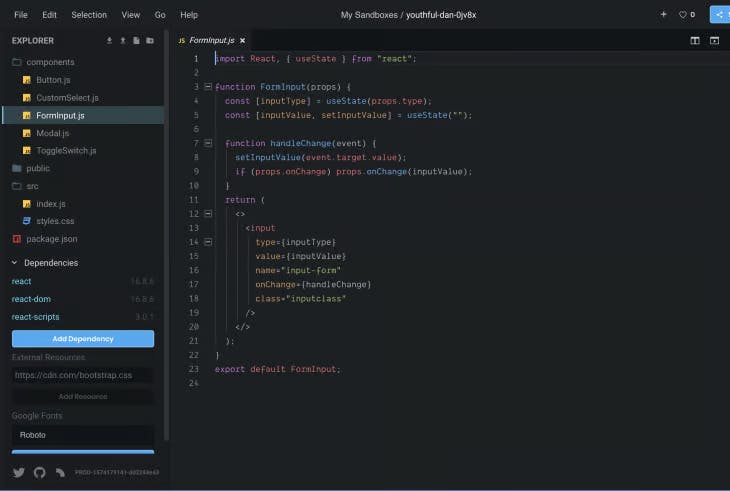
// ./components/FormInput.js
import React, {useState} from "react";

function FormInput(props) {
  const [inputType] = useState(props.type)
  const [inputValue, setInputValue] = useState('')

  function handleChange(event){
    setInputValue(event.target.value);
    if(props.onChange) props.onChange(inputValue)
  }
  return (
    <>
      <input type={inputType} value={inputValue} name="input-form" onChange={handleChange} class="inputclass"/>
    </>
  );
}
export default TextInput;
You can see the FormInput( ) component, which keeps a value in some definite format. It could be email, number, text, or anything else. Subsequently, to get something in return, we will have a function or method onChnage( ). The value will be local and render the modified value to the same component it calls first.
Here, handleChange( ) is a local function. It helps us to know whether the state data is available to receive and forward for further processing.
Reusable Button Component
You can use the different color buttons to differentiate their purpose throughout the applications. It will display the different aspects of a button. Create a separate file inside the component folder naming it Button.js.
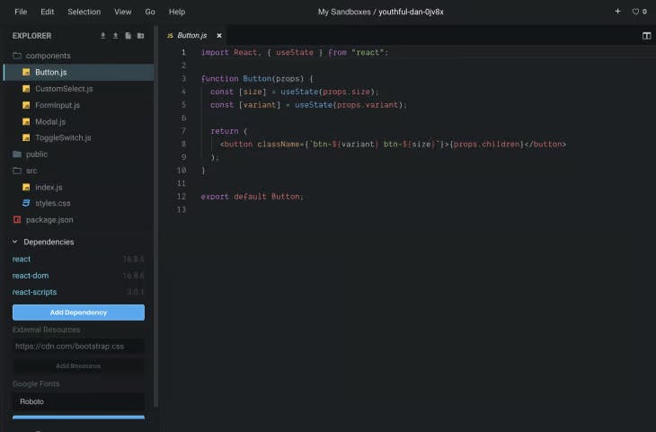
// ./components/Button.js
import React, { useState } from "react";
function Button(props) {
  const [size] = useState(props.size);
  const [variant] = useState(props.variant);
  return (
    <button className={`btn-${variant} btn-${size}`}>{props.children}</button>
  );
}
export default Button;
Here the button element props associate three properties. You can style the color, size, and other values. Use props.children render the dynamic of button content.
Reusable Toggle Component
While designing the form and wanting to send and receive datasets and values, we must recognize this Toggle component. You want to see a state transition from 0 to 1.
Again, we will create a file named ToggleSwitch.js inside the component folder for the react app.
// ./components/ToggleSwitch.js
import React, { useState } from "react";
function ToggleSwitch(props) {
  const [checked, setChecked] = useState(props.defaultChecked);
  const [Text] = useState(props.Text);
  function onChange(e) {
    setChecked(e.target.value);
    if (props.onToggleChange) props.onToggleChange(checked);
  }
  return (
    <div className={"toggle toggle-switch"}>
      <input
        type="checkbox"
        name={props.Name}
        className="toggle-switch-checkbox"
        id={props.id}
        defaultChecked={checked}
        onChange={onChange}
      />
      {props.id ? (
        <label className="toggle-switch-label" htmlFor={props.id}>
          <span
            className={
              props.disabled
                ? "toggle-switch-inner toggle-switch-disabled"
                : "toggle-switch-inner"
            }
            data-yes={Text[0]}
            data-no={Text[1]}
          />
          <span
            className={
              props.disabled
                ? "toggle-switch-switch toggle-switch-disabled"
                : "toggle-switch-switch"
            }
          />
        </label>
      ) : null}
    </div>
  );
}
export default ToggleSwitch;
A toggle component can contain different props for the different alerts at different states. You can use ID, checked, name, text, onChange, disabled, etc.
ID: Each form design toggle component carries an ID that will forward to the input control checkbox.
Checked: Access current state directly
Text: It carries the boolean value for two values array.
Name: for the checkbox input, we will use it as label text.
onChange: access return data
Disabled: Transition to the button state
At every transition, the state will be updated.
Reusable Select Component
You want to create a dropdown list using the select an option. Define a new file as CustomSelect.js with the following code:
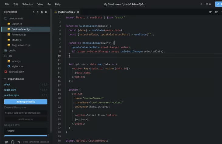
// ./components/CustomSelect.js
import React, { useState } from "react";
function CustomSelect(props) {
  const [data] = useState(props.data);
  const [selectedData, updateSelectedData] = useState("");
  function handleChange(event) {
    updateSelectedData(event.target.value);
    if (props.onSelectChange) props.onSelectChange(selectedData);
  }
  let options = data.map(data => (
    <option key={data.id} value={data.id}>
      {data.name}
    </option>
  ));
  return (
    <select
      name="customSearch"
      className="custom-search-select"
      onChange={handleChange}
    >
      <option>Select Item</option>
      {options}
    </select>
  );
}
export default CustomSelect;
Here, a select element will keep the datasets. We need to build the options tag before rendering. The option will be available locally and revert as output during the transition through handleChange().
Reusable Modal Component
Do you want to add alerts in react app adding a modal component will be great practice. Add a new file inside the component folder to separate the code for the modal and send the alerts.
Here is the code you can use:
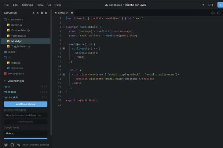
// ./components/Modal.js
import React, { useState, useEffect } from "react";
function Modal(props) {
  const [message] = useState(props.message);
  const [show, setShow] = useState(props.show);
  useEffect(() => {
    setTimeout(() => {
      setShow(false);
    }, 3000);
  });
  return (
    <div className={show ? "modal display-block" : "modal display-none"}>
      <section className="modal-main">{message}</section>
    </div>
  );
}
export default Modal;
Alerts display the message after getting the confirmation as a boolean value. It manages an event to occur or not. Either the State is set to true or false. If you want it to disappear after some time, we will use the function setTimeout( ). Also, we will use a hook useEffect( ).
Above, we have created some components; now, it is time to render them and see the output. So first, we will create a parent component and then try to manage the data. We will create an index.js file to showcase the functionality.
// ./index.js
import React, { useState } from "react";
import ReactDOM from "react-dom";
import FormInput from "../components/FormInput.js";
import CustomSelect from "../components/CustomSelect.js";
import ToggleSwitch from "../components/ToggleSwitch.js";
import Button from "../components/Button.js";
import Modal from "../components/Modal.js";
import "./styles.css";
function App() {
  const data = [
    {
      id: "1",
      name: "One"
    },
    {
      id: "2",
      name: "Two"
    },
    {
      id: "3",
      name: "Three"
    },
    {
      id: "4",
      name: "Four"
    }
  ];
  function handleChange(event) {
    console.log(event.target.value);
  }
  function onSelectChange(event) {
    console.log(event.target.value);
  }
  function onToggleChange(event) {
    console.log(event.target.checked);
  }
  return (
    <div className="App">
      <form>
        <Modal show={true} message={"Hello"}>
          <p>THIS IS A MODAL</p>
        </Modal>
        <FormInput type={"text"} onChange={handleChange} />
        <FormInput type={"email"} onChange={handleChange} />
        <div>
          <CustomSelect data={data} onSelectChange={onSelectChange} />
        </div>
        <div>
          <ToggleSwitch
            id="id"
            defaultChecked={false}
            disabled={false}
            Text={["Yes", "No"]}
            onToggleChange={onToggleChange}
          />
        </div>
        <Button variant="danger" size={"sm"} >Small Button</Button>
        <Button variant="primary" size={"lg"} >Smaller Button</Button>
        <Button variant="warning" size={"xs"} >Big Button</Button>
      </form>
    </div>
  );
}
const rootElement = document.getElementById("root");
ReactDOM.render(<App />, rootElement);
Wrap:
Here we have visualized only 4-5 components for rendering with a form. But we can create more as per our preferences of the react app. You can use the navbar, header, footer, pageLoder, Toolip, and others. You will have full control over all the components. These react reusable components eliminate the mess that comes with classes and only visualizes the essential piece and functionality for better appearances.